How I Analysed Backtested Data To Build A Maturity Graded Framework

I built a maturity grade for my trading system. It passed every test I threw at it. Then I watched it run for a couple of weeks, looked at the actual entries it was lighting up, and realised it was telling me almost nothing useful.
Not broken broken. Just… useless.
No automated test caught that. I did, with my own eyes. And that one gut-check kicked off 7 full days of ripping the thing out and rewiring it from scratch.
This is the story of how I got it wrong, what 900,000 backtested trades told me once I actually went looking, and how a single grade grew into something that reads a stock across three timeframes. It’s a long one. Grab a coffee. And if you stick with it to the end, I’ve left the whole thing there for you to take away for free: the full algorithm ready to hand to an AI, the badge tool I built for it, and all the data behind it.
Quick disclaimer before anyone gets ideas: I am not a data scientist or a quant (though I have always had an eye for detail and engineering logic), none of this is advice, and everything below is from a personal backtesting sandbox. Right, let’s go.
What a “maturity grade” is even for
I trade swing setups. Pullbacks, mostly. And there are really only two ways to be wrong on timing, no matter how good your entry rules are.
You can be too early. The stock isn’t ready, it chops sideways, and you keep getting stopped out for tiny losses that bleed you to death. Or you can be too late. You buy after the move has already run, right at the top, and you’re now holding the backside of the trend while everyone who got in early sells into you.
So the question I wanted answered, at the moment of entry, was simple: where in its move is this stock right now? Early, ripe, or already cooked?
In my own words from the planning notes: an important signal that I’m “not too early (constantly stopping out), or entering at the peak and its going to become backside of the trend.” That’s the whole job of the maturity grade. One letter, A to E, that tells me where in the cycle I’m buying.
Sounds simple. It was not simple.
Four months of backtesting is the only reason any of this works
Here’s the unsexy bit nobody puts in the highlight reel.
The only reason I could even ask these questions is that I’d spent roughly four months running backtests, nonstop, across different datasets. Not for fun. That grind built up a pile of historical trades I could actually interrogate. By the time I started on maturity, I had a base of 938,680 backtested trades spanning 2011 to 2026, cut into 20 different period slices, plus a separate independent set of another 112,550 trades I keep aside purely to check whether a finding holds up out of sample.
That dataset is the thing. As I put it at the time: those datasets let me “create scripts to add new columns and populate and find behavioural patterns to hypothesis and theories which would stay theory if I didn’t have these backtested data.”
That’s the part people skip. A hunch about how stocks behave is just a hunch. The second you can bolt a new column onto a quarter of a million real historical entries and measure it, the hunch either lives or dies on the numbers. So I wrote a script that graded every single ticker on every entry day, three timeframes each, and spat out 253,012 rows with six fresh columns (a daily grade, a weekly grade, a monthly grade, and a score for each). New columns on old trades. That’s the entire game.
Attempt one, and why I binned it
My first maturity grade, the one with the sweetspot range, was clever. Too clever, that is.
It worked by ranking every entry against the entire pool of other entries on a basket of features, then handing out a percentile. Top of the pile got an A, bottom got an E. Felt rigorous. Felt like proper data science.
Two problems killed it.
First, when I finally checked the grade against what trades actually did, the relationship was basically noise. The correlation came back around 0.04 to 0.09. For anyone who doesn’t stare at this stuff: 0 means no relationship at all and 1 means perfect, so 0.05 means you may as well flip a coin. My fancy grade was a coin.
Second, and worse, ranking against “the whole pool” means you need the whole pool to exist before you can grade anything. In practice that pushed the calculation to after the period had closed. Brilliant. A signal that can only tell you how ripe a setup was once it’s far too late to do anything about it. Worse still: what if I cleared my backtest data and only had a handful of tickers loaded instead of the full thousand-plus? The grade shifts under my feet, because it is ranked against whatever pool happens to exist at the time. Yeah. Daft way to grade anything, in hindsight. I learned that one the hard way too, by building it, running it, and watching how useless it really was.
I caught the uselessness by eye first, just from watching it. The data then told me exactly how dead it was. Don’t get me wrong, that stung a bit. But better to find out from the backtests than from my account. Out it came.
Back to basics: stocks that actually move
When I rebuilt it, I went back to basics, keep it simple stupid, and asked the dumbest possible question. What actually makes money?
So I set Claude Code loose on a pile of dead-simple ideas. The brief: spin up a throwaway test column for each one, some basic calculation like ATR (average true range) over different lookback periods, but anchor it to reality. First find all the genuinely profitable, high reward-to-risk trades, then shape each calculation so those winners grade high and the losers grade low. Off it went for hours, churning through script after script, idea after idea. So many dead ends. Here’s the whole journey, from a pile of candidate columns down to the single grade I actually kept:
| stage | count | what it was |
|---|---|---|
| Candidate columns generated | ~80 | every dead-simple idea as its own column: ATR over different lookbacks, distance from the high, coil and compression, momentum, relative strength, volume dry-ups, on and on |
| Columns that actually worked | 15 | the ones that genuinely separated winning trades from losing ones |
| Grading formulas tried | 9 | different ways of blending those down into one A to E grade, ranked head to head |
| Kept | 1 | the survivor: how expanded the range is, plus a couple of extra terms on the monthly |
Eventually it landed on something that held up, so we tested it on other edge scenarios from our backtest data slices.
My answer, typed in frustration somewhere around hour 30: “we want stocks that is increasing in volatility… where money is made. we dont make money if stocks dont move!”
So instead of a clever composite that ranked everything against everything, I graded one honest thing: how stretched is this stock’s recent range compared to its own long history? Expansion. Is it waking up, or is it asleep? A to E, A being the most expanded. The nice side effect is you can compute it at any bar in history without needing the rest of the pool, so it works live and it works in a backtest with the exact same code path.

Then I tested it properly, train on the past, check on the future, and I forced myself to be honest about the result:
| timeframe | grade A avg | grade E avg | clean ladder? | verdict |
|---|---|---|---|---|
| daily | +0.07R | −0.20R | yes (A beats B beats C…) | keep |
| weekly | +0.90R | +1.05R | no, jumbled | weak |
| monthly | +1.39R | +1.86R | no, jumbled | weak |
(R is reward measured in units of my initial risk, so +2R means I made twice what I was risking. It’s the only fair way to compare a £200 risk to a £2,000 one.)
On the daily it’s a clean signal: A grades beat B beat C beat D beat E, in order. On weekly and monthly it’s noisy and the ladder falls apart. So I didn’t pretend. I kept the grade as a contributing nudge that stacks on top of my existing selection, not as some magic filter that makes the decision for me. As I keep reminding myself: “it’s not about win rate. it’s about winning trades! with risk reward.”
It sounds simple, just letting AI rip and come back with results. Unfortunately that’s not how shit works with AI. You need to know what you’re doing, and most of the time AI will get it wrong.
I had to instruct Claude Code to build the testing ground above in stages:
- A combined, deduped table of all the backtests, so nothing gets double or triple counted.
- Then split that out across all the tickers.
- Then split out just the Tactical Smart Layer Compounder (TSLC) grade A and B trades, basically the top P&L and most efficient performers.
- Then do steps 2 and 3 again on sliced backtest data, cut into different date periods, anything from a single 15-year run down to ten separate 1-year slices, with 10-year and 3-year windows in between.
- Then do steps 2 and 3 again on slices built with different bounce parameters: 2pc, 3pc, 4pc and 4pc_v2.
- And all of that, on every test, only for the ideas that showed promising logic for understanding how a stock moves before it trends upward, so I could actually grade it.
Sounds easy, right? I had to devise this myself. AI could not come up with it. I tried letting it loose on max thinking mode with a dynamic workflow and it got nowhere, after hundreds of subagents picking it apart and millions of tokens burned.
This whole loop, the rip-out, the rebuild, the honesty checks, all ran through Claude Code under my own SST3-AI-Harness.
My theory: when the timeframes line up
Now the fun part. The bit I was sure I was right about.
Staring at charts for months, I’d built up a strong gut feeling. The biggest winners, the ones that ran 20, 40, 80 times my risk, all seemed to happen when the daily, weekly and monthly charts were maturing together. When everything lined up. So I wrote it down as a proper hypothesis: “some of the best performers are when each timeframe maturity lines up… analyse our sliced data and 4pc, 2pc, and 3pc (partial 75% complete at the time) if my theory is right or wrong that when timeframe maturity aligns, it performs better in terms of P&L?”
Note: 4pc 2pc 3pc is because I’ve been toying with some settings changing the bounce tolerance from 4% down to 2% from the slow (top) MVWAP period before it counts as an actual bounce. Our backtest strategy uses the slow (top) MVWAP periods for entries in it’s calculation hence why these tweaks will alter the backtest trade entries immensely.
And I told Claude to test it on everything. “do a full wide research on ALL our sliced datasets, when I mean all, I mean all!” Combined dataset first, then each sliced time period, then the four fixed bounce-tolerance datasets I keep (we call them 2pc, 3pc, 4pc and 4pc_v2) so nothing rides on a single lucky window.
The verdict came back and it was not what I wanted to hear:
| filter | trades | avg R | win % |
|---|---|---|---|
| everything (baseline) | 284,410 | −0.19R | 36% |
| my own timeframe hot | 128,232 | −0.06R | 38% |
| all three lined up | 78,055 | −0.24R | 33% |
| own timeframe hot, others NOT all maxed | 50,177 | +0.23R | 46% |
Read the bottom two rows. Requiring all three timeframes to be hot together (my beautiful theory) did worse than taking literally everything. And the actual edge was the opposite of what I believed: own timeframe hot, but the others still have room to run.
My theory was wrong. Properly, measurably wrong, across all 20 slices and confirmed on the independent set. And I was weirdly happy about it, because now I knew something true instead of something I’d hoped.
The ripple: being early beats being aligned
Here’s the reframe that made it click.
Maturity doesn’t line up. It ripples. It moves from fast to slow, daily then weekly then monthly, like a wave passing through the timeframes. And the money is in being early in that ripple, not late.
The best setup is: your own timeframe has fired, a faster timeframe is confirming underneath you, and the slower, bigger timeframe is still cold. That cold higher timeframe is the room above your head. That’s where the move can still go. By the time everything is hot (A·A·A, all three maxed), the ripple has already finished. You’re late. You’re buying the top.

You can see it cleanly when you sort trades by the shape of the gradient across the three timeframes:
| shape | what it means | trades | avg R | win % | median |
|---|---|---|---|---|---|
| descending (fast hottest) | early, room above. ENTER | 13,072 | +1.13R | 70% | +0.83 |
| tent (weekly leads) | mid-cycle | 2,001 | +1.40R | 65% | +0.74 |
| flat (all equal) | late but ok | 10,558 | +0.50R | 57% | +0.43 |
| valley (weekly lags) | divergent | 2,824 | +0.33R | 57% | +0.48 |
| ascending (slow hottest) | the backside. AVOID | 7,610 | +0.05R | 44% | −1.06 |
Descending versus ascending is a different planet. Front of the move, +1.13R and you win 70% of the time. Backside of the move, basically breakeven and a losing median (that −1.06 means more than half of those trades close at a loss). Same system, same stocks, opposite outcomes, decided purely by which way the maturity gradient is pointing.
There are messier in-between states too. A “tent” where the weekly is the hot one in the middle. A “valley” where the weekly lags. And my favourite to watch out for, the “too early” setup, where the daily has fired but the weekly hasn’t confirmed yet. That one still makes money, just less, and it stops out more. So it’s a downgrade, not an avoid. Patience, basically.
One thing worth being clear on before the next table. Nothing here rides on a single lucky dataset. I tested the whole idea in stages, on purpose: the big combined set first, then each individual period slice, then a final pass on my four fixed datasets with the proper backtest windows. The table that follows comes from that final 4pc set, but the same pattern had already shown up at every stage before it, across different periods and different edge cases. It held up every time. That consistency is the only reason I trust any of it.
The box that turned out not to be a box
This is the table I kept coming back to, and the one that taught me the most. The question that finally cracked it was about my stop loss: which patterns are least likely to hit my initial stop? Hitting that initial stop means I got in too early, the stock wasn’t ready, and it shook me out for a loss. So the patterns that almost never hit it are the ones where the stock genuinely broke out from the off and kept running, instead of chopping around first. In short, a low stop-out rate points straight at the backtested trades that took off and rode the breakout upward. That low stop-out rate became my cutoff line, and pinning it down was the last real piece of the analysis.
Once I’d found the three best patterns (A·A·E, A·A·D and B·B·E), I assumed “top maturity” was a tidy geometric box: daily A or B, times weekly A or B, times monthly D or E. Eight corners. So I asked the obvious question: “is it just the top-3 {A·A·E, A·A·D, B·B·E} or an actual band between those 3?” And I checked every corner of the box.
A quick word on the numbers below, because it matters. They come from the roughly 36,000 trades my system would actually take: the ones that clear my filters and carry a complete grade on all three timeframes. Not the full 938,680 raw backtests, just the genuinely tradeable slice of them. The “% of pool” column is each pattern’s share of that 36,000.
| pattern (D·W·M) | trades | % of pool | avg R | stop-out % | verdict |
|---|---|---|---|---|---|
| A·A·E | 292 | 0.8% | +2.88R | 16% | top tier |
| A·A·D | 246 | 0.7% | +2.34R | 17% | top tier |
| B·B·E | 582 | 1.6% | +2.28R | 19% | top tier |
| a real ~0.8R cliff sits here | |||||
| B·B·D | 673 | 1.9% | +1.07R | 28% | falls off |
| A·B·E | 352 | 1.0% | +1.38R | 24% | early peak, weekly confirming |
| A·B·D | 201 | 0.6% | +0.81R | 33% | early peak, weekly confirming |
| B·A·D | 50 | 0.1% | +0.95R | 44% | poor |
| B·A·E | 25 | 0.07% | +4.64R | 16% | n=25, noise |
Read it left to right: each pattern is Daily·Weekly·Monthly, A is the most expanded, E is dead cold. The stop-out % is how often that pattern hit its initial stop, so a lower number means the trade rarely got shaken out and was more likely to just keep running.
The box was a lie. In this 4% cut, only three of the eight corners stand out (all above +2.28R with one-in-six odds of stopping out). Below them there’s a real cliff, a drop of roughly 0.8R, and the rest fall off hard. The A·B ones (A·B·E, A·B·D) sit lower here because the daily has run hotter than the weekly. Not out of sync exactly, the weekly is still confirming underneath, just a notch less mature than the leaders.
Then there’s B·A·E, sitting at the bottom looking like the best thing on the whole board at +4.64R. Ignore it. It’s 25 trades. Out of a tradeable pool of around 36,000, that is far too small a sample to trust: one or two lucky runs and the average flatters itself. It’s noise, not an edge, which is exactly why I don’t lean on it. The strong patterns rest on over a thousand trades between them, a bit over 3% of the pool, which is enough to mean something.
It’s worth saying why even the good patterns look small. Maturity grades across the three timeframes tend to move together, so most trades stack up where all three are roughly the same. A deliberately out-of-step shape like A·A·E is rare by design, not a hole in the data. A few hundred trades in one specific pattern isn’t thin, it’s just how often that exact shape actually shows up.
So “top maturity” isn’t a box and it isn’t a score threshold. That was where I first landed: three proven patterns the data picked, not me. But three hand-named patterns is still a list I’m maintaining by hand, and the moment the bounce settings shift, the list shifts under me. So it grew up. What runs now is a ranking. It scores every Daily, Weekly and Monthly combo by how reliably it stayed out of its stop and what it paid when it worked, weighted by how many trades stand behind it, then surfaces the top of the list: the top 20 across the daily and weekly views, the top 10 on the combined and monthly ones.
It’s all about the shapes, with the metrics to back them up
Coming out of all that, here’s the bit that still does my head in, the thing I only really got once every one of my hypotheses had been thrown out the window. Building a grading system turned out not to be about A = best and E = worst at all. That whole framing was wrong. It’s about the shape across the three timeframes, with the metrics there to back up how each shape actually performs. It’s all about the shape!
And here’s the humbling bit. My tidy three don’t own the top of it. B·B·E does lead, top of every view. But A·A·E, the best single row in the table above, lands around sixth, and A·A·D, the third pattern I was so pleased with, doesn’t even make the combined top ten. Five other shapes outrank A·A·E, some of them mixed C-grade combos I’d written off as middling. The ranking weighs the evidence the way I should have all along: a pattern with twice the trades behind it earns its place over a flashier one with barely a few hundred. The three patterns got me started. The ranking is what I actually read off the screen now.
And here’s the part that took me longest to make peace with: just how small that breakout-ready slice is. Across my whole watchlist of around 1,225 stocks, only about 25 a week typically light up as breakout-ready, roughly 2% of the board. For any single stock it’s rarer still, most names hit one of these maybe once a year, with something like six months between turns. But 25 is just the average, and they don’t trickle in evenly. They come in waves, from a handful in the quiet stretches to fifty-plus in the busier ones. Broader market conditions probably play into that too: when the wider market gets going, a batch of names tend to break out together. That cluster is my actual entry window, the stretch where I put my limited capital to work and ride the move, instead of forcing trades through the dead weeks in between. So the scarcity stopped feeling like a problem. It means waiting for the right pitch instead of swinging at everything, playing tight instead of gambling on rubbish odds, then backing it properly when the wave finally shows up.
Colour for quality, grey for timing
Last piece. None of this matters if I can’t read it at a glance while I’m planning a trade.
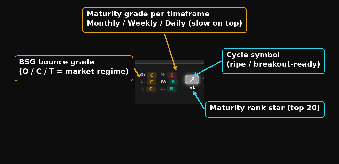
I settled on two separate visual languages, on purpose. Colour carries quality. The letter grade runs a traffic light from green at the top to red at the bottom: A is green, then teal, amber, orange, and E is red. Green good, red avoid, the way your eyes already work. Grey I reserved for one thing only, no data, so a missing grade can never be mistaken for a real one.
Then for the timing read I deliberately did NOT use more colour. I’d already learned the screen gets noisy fast, and at one point I just told myself “keep it white… too much colour.” So it uses a white symbol carrying two things at once. The brightness tracks where the setup sits in that live ranking: brightest at the top of the list, dimming as it drops down the order. And the shape shows which way the move is heading. Up for the ripe setup you want to enter, down for the backside to avoid, flat when it’s extended and too late, and a wavy one for the too-early setup where the daily ran ahead of the weekly. The shape reads in a fraction of a second, even out the corner of your eye.

That whole cycle is an inverted-U, and seeing it as one curve is what finally made the framework feel right:
| phase | example pattern | avg R | stop-out % |
|---|---|---|---|
| dormant (asleep) | E·E·E | +0.27R | 46% |
| building | B·B·E | +2.28R | 19% |
| the peak | A·A·E | +2.88R | 16% |
| extension | A·A·B | +1.35R | 32% |
| fully cooked / backside | C·B·A | −0.28R | 61% |
It climbs out of the accumulation, peaks dead centre at the breakout-ready zone, then falls off the back as the move exhausts. Buy near the peak of that curve, not on the way down the other side.

And then I built it for real, live while I was writing this. Full screen first, sorted by maturity with the filter on:
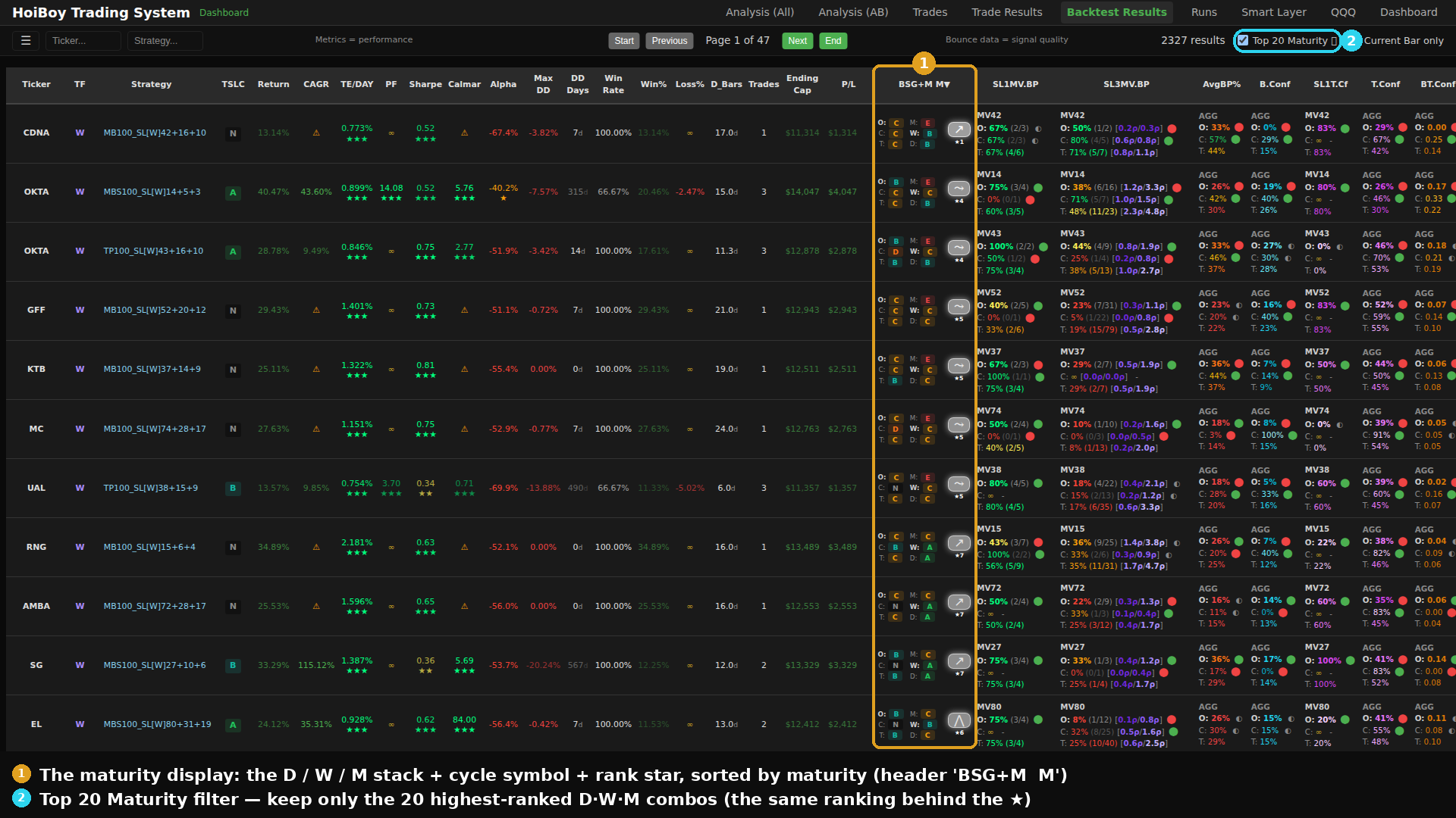
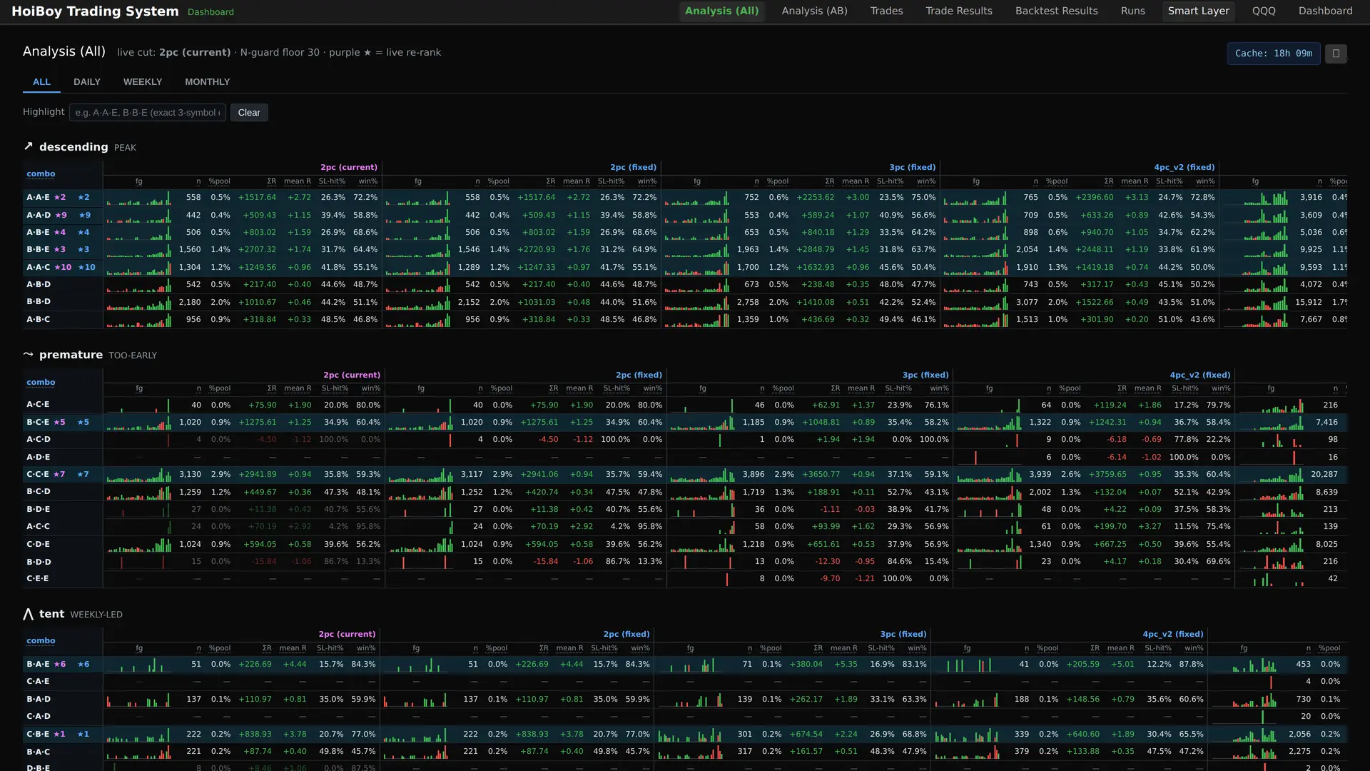
That same ranking gets its own page too, every combo scored and sorted, the top of the list starred:
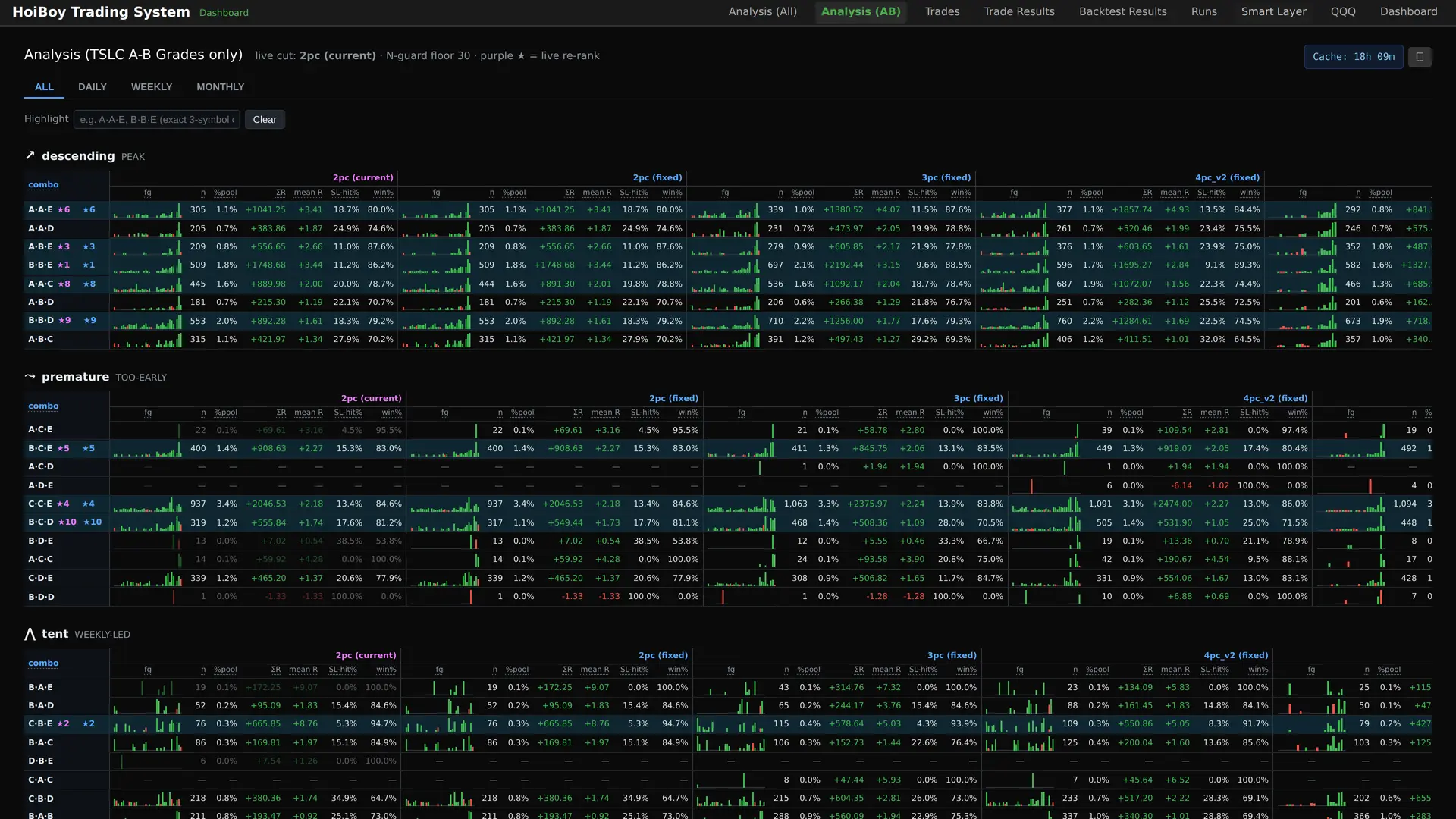
And the same ranking filtered down to just the trades my system would actually take, the TSLC-A/B set:
One row up close, the bounce grade beside the three-timeframe stack:
On the price chart, a badge under each entry marks how ripe it was when I got in:
It is a decision aid on my screen, something I check before pulling the trigger. Not an auto-pilot placing trades for me. I want another honest data point, not a black box making the call.
Welcome to data science (just kidding)
Welcome to data science! Just kidding. I never studied data science. This is just what I think is a logical, step-by-step way to experiment and solve any problem, not a textbook one. It’s me looking at the analysis, trying to work out what it’s actually telling me, and conversing with Claude Code asking why, what, where and how, over and over, until the picture holds together. I direct, it does the grunt work of slicing the data, I look at what comes back and form the next question. Round and round. All of it under my own SST3-AI-Harness, which is what keeps a build this fiddly from turning into a pile of half-finished spaghetti.
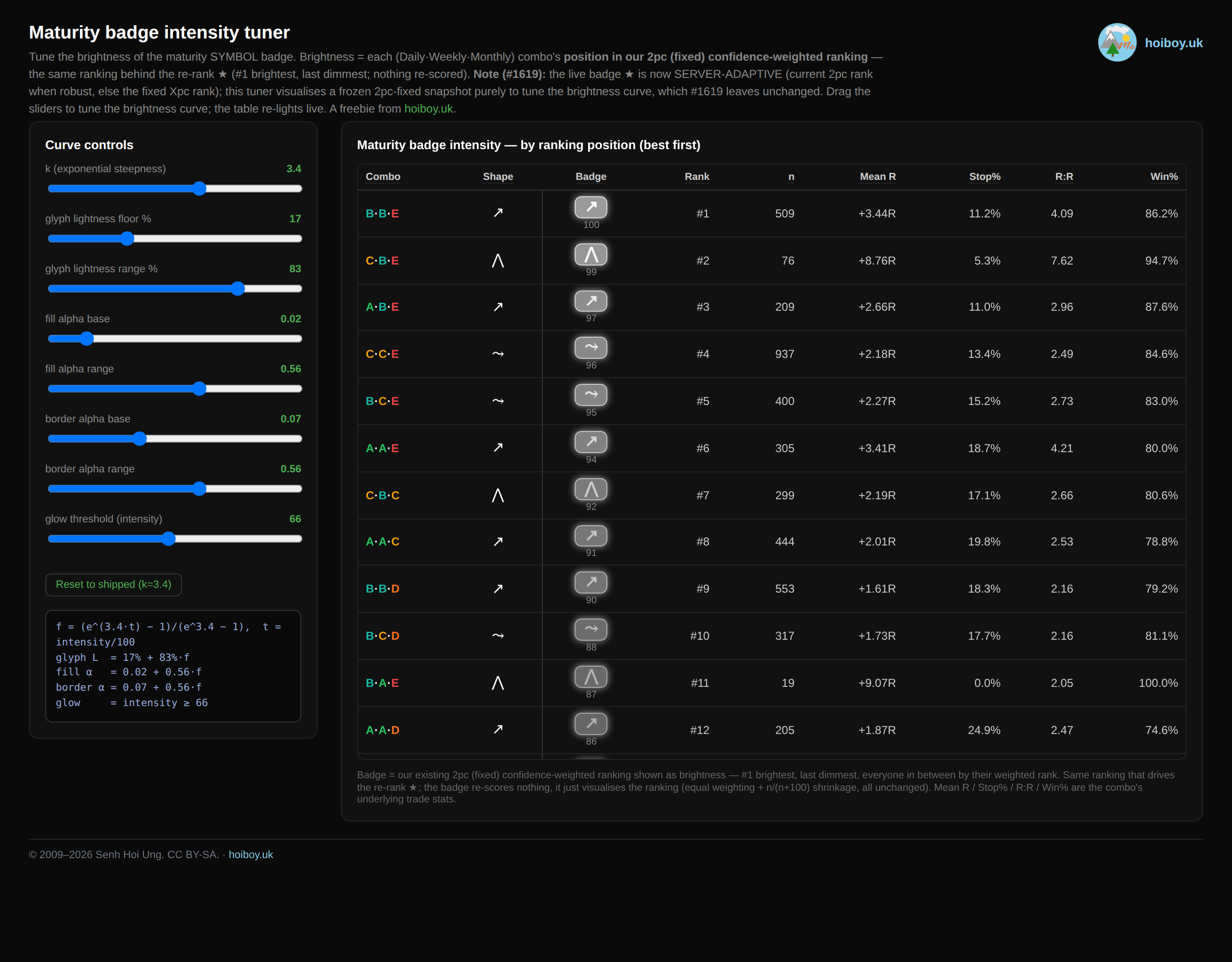
Here’s what that grind looks like. I had Claude Code build me a throwaway tuner just for the badge brightness. Drag a slider and the whole column re-lights, and I nudged it until the falloff felt right against the real dark dashboard. One cosmetic decision, its own little tool.
And here’s the part I really want to land. This was 7 full days of nonstop work to create one feature. One. It still genuinely amazes me when people claim they built some whole app in an hour, or a day. Maybe they did. Mine took ripping out a broken idea, testing a theory I was sure about and watching it fall apart, and rebuilding the whole thing from the data up.
I hope that sets some expectations about what it actually takes to build a platform, or any decent app you want to trust with real money. It’s not easy, even with AI. You still need to do the thinking, and a lot of it. That’s what you’ll spend most of your time doing.
The AI sliced the data. It didn’t decide what the data meant. That part was still me, squinting at a screen at 2am, going “hang on, that’s not right. wtf? why?”
Now my new maturity grading feature is in place. Fingers crossed for how it goes with live trades! I already have a good feeling about this one, but time will always tell the truth. Let’s wait and see :)
Made it to the end? Here’s the lot, for free
Genuinely, thank you for reading the whole thing. That was a long one, and if you got all the way down here you clearly care about this stuff, which I respect a lot. So here’s what I promised up top, free to download and pull apart.
Quick note on the links below: they all open in a new tab. If you would rather grab your own copy to keep, just right-click the link and choose Save link as.
First, the actual algorithm. The whole maturity grade written out in full: the formulas, the lookback windows, the grade thresholds, and a working reference implementation in Python. I wrote it to be handed straight to an AI (Claude, ChatGPT, whatever you use) so you can drop it into your own system and start playing. It’s no big secret, and honestly it might save you the months it took me to land on it.
Next, the little tool I built to dial in how those grades look on screen. Drag the sliders and the whole set of maturity badges re-lights, so you can tune the brightness curve to your own taste. Between the algorithm and this, you’ve got the whole set: the maths and the look.
And finally, the data behind the post. The same combo-by-combo numbers behind the whole ranking:
- Download: every maturity combo, all backtested trades (HTML)
- Download: every maturity combo, the TSLC-A/B tradeable set only (HTML)
The two data files are self-contained pages: every Daily, Weekly and Monthly grade combination, how many trades it produced, the average R, the stop-out rate and the win rate, laid out so you can see which shapes carried an edge and which were just noise. The first is the raw universe of backtested trades, the second is filtered down to the trades my system would actually take. As I said, this came out of four months of backtesting across my eight strategies, working out what holds up and what doesn’t. If I had to put a price on what I’m handing over here, it’s worth more than £100K to me, and even that’s a fraction of the real value: 3.5 years learning to trade, 20-plus years of engineering, and 40-odd years of life experience, all of it baked into where the platform sits today and into building this universal grading system.
Fair warning: it’s raw research, not a polished product. Read it the way I do, as a pile of evidence to argue with, not gospel.
And the obvious bit. None of this is financial advice, and I take no responsibility for what you do with it. It’s here for you to learn from, adapt, and play around with. If you win, great. If you lose, well, that’s on you, not me, haha. It’s not like I charged you a pretty penny for it. Have fun.